In 1814, Abraham Gottlob Wernerand Patrick Syme’s color taxonomy, Nomenclature of Colours, was published. Their charts drew on human conceptions of nature and grouped color into shades based on their appearance on bodies, vegetation, and landscapes. Developing shades such as “Gamboge Yellow” from its common appearance in sulfur, yellow jasmine and goldfinches, their work was used by painters, zoologists, and botanists alike, cementing not only conceptions of color but also ideas of how nature should look. Imbued with emotion and texture, their descriptions perpetuated ideas of nature as vibrant and pure, which has in turn crystallized our contemporary expectations. For instance, “sky blue” does not conjure the smog of pollution; “grass green” does not evoke the brittle yellow of drought; and “snow white” does not accommodate the grey slush of warming ice caps.
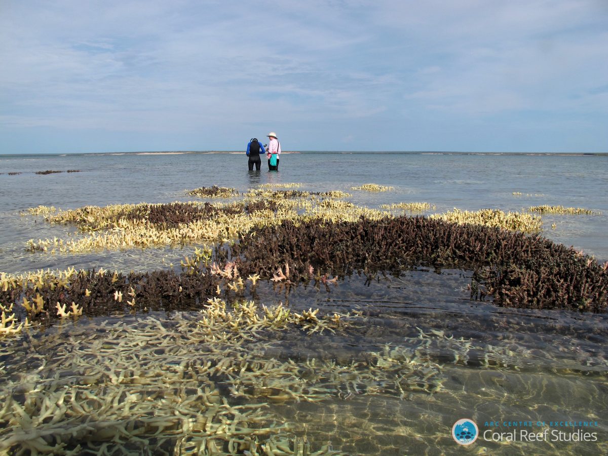
In a recent installation at Tate Britain, entitled Salmon: A Red Herring, Cooking Sections — a London-based artistic duo (Daniel Fernández Pascual and Alon Schwabe) — showed how ecological degradation is affecting color. Their work consists of three main parts: a diorama of white animals, a light display illuminating these models in shades of salmon, and an accompanying audio essay narrating the abuses of industrial farming. Specifically, this work intended to draw attention to the practice in Scottish fisheries of dyeing salmon “salmon pink” using Pantone color charts. Denied their usual diet of krill and shrimp, this dye masks the abuses of aquaculture — overcrowding, parasites, and genetic modification — which have manifested in the fishes’ grey pallor. Cooking Sections explains that “Salmon is the color of a wild fish which is neither wild, nor fish, nor even salmon.” This distortion of color is oddly ubiquitous and is equally applicable to both “orange” and “coral,” where temperature rise has led to oranges being dyed “Citrus Red No.2” for consumers and coral reefs being bleached white. While this may give us reason to challenge our comprehension of color, it also gives us grounds to reflect on our relationship with the environment and — to steal from Lewis Carroll — our proverbial compulsion to “paint the roses red” when it comes to its decline.

This desire to cover up ecological degradation through adding color constitutes a kind of denialism. In his photographic series Industrial Scars J. Henry Fair seeks to unearth the hidden impact of the things we buy. His work is largely concerned with color, presenting aerial images of lakes stained green from pesticides, metallic gray slicks from oil spills, and flats of vibrant red mud from toxic aluminum production. They evoke an insidious sensation of seepage — showing how the impacts of extractivism are already far out of our control. As Cooking Selection argues in their publication for Isolarii press (also entitled Salmon: A Red Herring): “Color exposes the global entrails of agribusiness and petro-chemical industries that feed, fill and taint bodies.”
Our disconnection from these scars evidences the simultaneous alienation of consumers and the control of industry. Connecting this with salmon, when we purchase a dyed fish, the dye not only conceals the experience of the fish itself but feigns away from these broader environmental threats and their entailed color shifts. At the same time, the very act of controlling color is one of subjugation; it is another means by which people can objectify and instrumentalize species in terms of our desires and emotions. In this sense, salmon is denied its autonomy as a living, breathing, and adapting thing, and is rather perceived as a blemish in need of correction. In effect, we, to quote Cooking Sections, “are reducing them to color instead of acknowledging their place in the flow of color,” and our desire to simulate the natural increasingly often comes at the detriment of nature itself.
Disrupting these expectations can help us re-engage with the ecosystems that surround us. In his Green River project, Olafur Eliasson used uranin — a water-soluble dye used to test ocean currents — to turn six rivers phosphorescent green, including waterways in Bremen, Stockholm, Venice, and Los Angeles. This project was met with a combination of admiration and derision but nevertheless achieved its intended purpose of reconnecting pedestrians with their surroundings.

These artworks show us that while color can render us passive, it can also be used to challenge our relationship with the environment. In the context of climate catastrophe, they reveal how the lines between natural and artificial color have been increasingly blurred. In particular, at a time where eutrophication and bright, emerald algal blooms are becoming more commonplace, Eliasson’s work takes on a new significance: More than disruption, it may also serve as a premonition of things to come.
0 Commentaires