People encounter “mid-century modern” everywhere in today’s media landscape — from home makeover shows on HGTV to furniture stores such as Room and Board and magazines such as Dwell. Modern interiors from the 1940s, 1950s, and 1960s were characterized by open-concept plans, with a clutter-free floor that allowed the viewer sexy glimpses of metal furniture legs or sculpted wood frames holding up a sofa or table. If this sounds like every modernist interior you’ve seen recently, this experience only attests to the pervasiveness of the mid-century design ethos. Many pieces of modern design furniture sold today are indebted to popular designs of the postwar decades: chairs, tables, and storage devices by highly collectible names like Charles and Ray Eames, George Nelson, Paul McCobb, T.H. Robsjohn-Gibbings, and Hans Wegner. Clearly these designs have appeal now — but what do we actually know about their history? Who was buying this furniture when modernism was new, and why?
The first thing a savvy reader of this article will note is that, of the names I listed in the previous paragraph, all but one are male, and all are white. Such demographics reflect a massive power discrepancy in the mid-century design world. It was a career marketplace where white men predominated; women and designers of color were less numerous, and their work as an associate in a design office meant their creativity often went uncredited. (Today’s design world is marginally better, although still plagued by similar issues.) But the history is more complex than just the question of who designed this furniture. The meaning of these designs for mid-century consumers can be found in how the designs were advertised, how they were used to advertise other products, and how — in short — they appeared in the media landscape of the postwar decades. When we look at “mid-century modernism” through the lenses of mid-century media, it begins to look different from the design attitude we think we know.
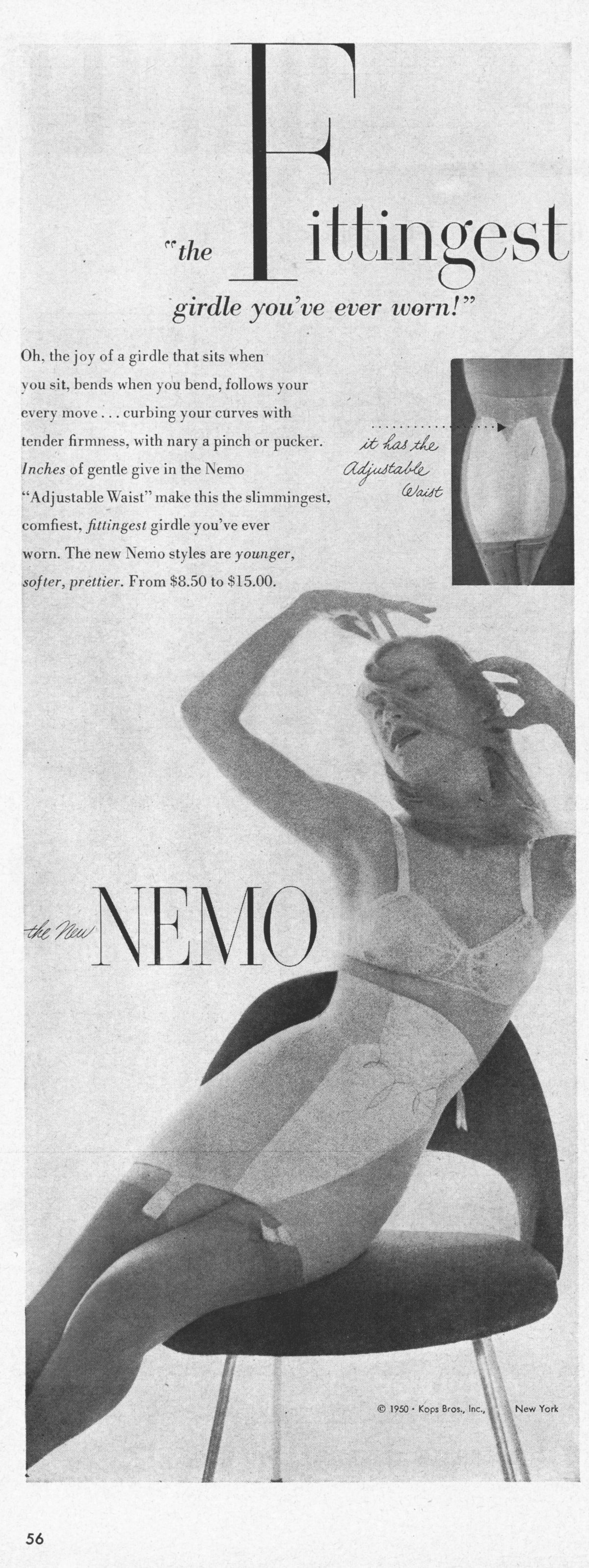
Take, for example, the highly successful designs of Eero Saarinen, whose chairs and tables were manufactured by Knoll Associates beginning in 1946. His Model 72 side chair (1948) makes countless media appearances in the postwar years, including in an advertisement for girdles that appeared in Life throughout 1950. The model in the ad drapes her girdled figure across Saarinen’s chair, and we are meant to equate the beauty of her sculpted curves with the beauty of the chair’s curves. Indeed, the girdle (and the chair, perhaps?) does more than make her beautiful: As the copy explains, it “curb[s] your curves with tender firmness.” Here is a chair to keep you in your place within the social and patriarchal order.

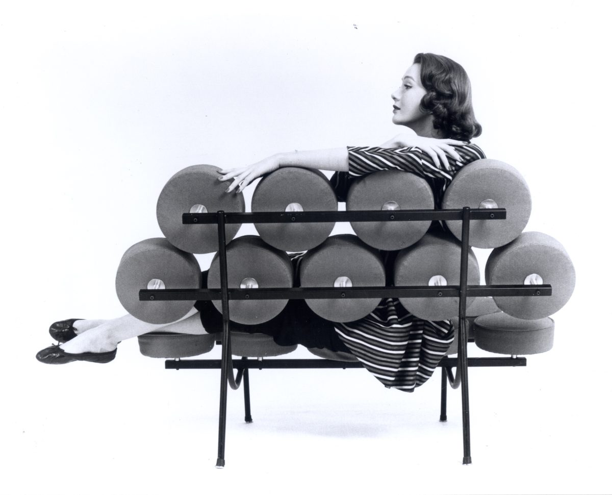
A well-known competitor to Knoll in the mid-century furniture industry was Herman Miller (the companies are still rivals today), and its design director, George Nelson, seemed to have a similar approach to women and chairs. When he wrote about chairs in 1953, he argued that in modern houses, “The only place left for furniture is out in the open. Hence silhouette becomes important … One might now compare [a chair] to a girl in a Bikini suit.” His office designed a sofa in 1956 affectionately known as the “Marshmallow Sofa.” While it was spectacularly unsuccessful as a commercial product, its status as a legendary design was cemented through photographs of women seated on it, viewed through its back. The women are trapped behind a grid of dots, their bodies tantalizingly half-hidden, always on display.

These photographs suggest that in the mid-century years, chairs by white designers kept white women both on view and in their place. The designs were somehow invested in exerting control. Interestingly, when you take a broad view of modern design in Life magazine over the decade of the 1950s, one of the places it appears most frequently is in advertising for cleaning products — floor waxes, vacuum cleaners, rug shampoos — as well as products that would make your home seem newly cleaned, like paint or wall-to-wall carpeting. People often talk about modern design seeming very “clean,” but in the 1950s it was the prop of cleanliness. Modern design’s vigilant stance against dirt in the advertising realm of Life is not just a form of control — it is also a form of exclusion. The protagonists of these advertisements are invariably white women. The modern designs in their clean homes in racially segregated suburbs become props to reinforce their whiteness, and to insist on racial exclusion.

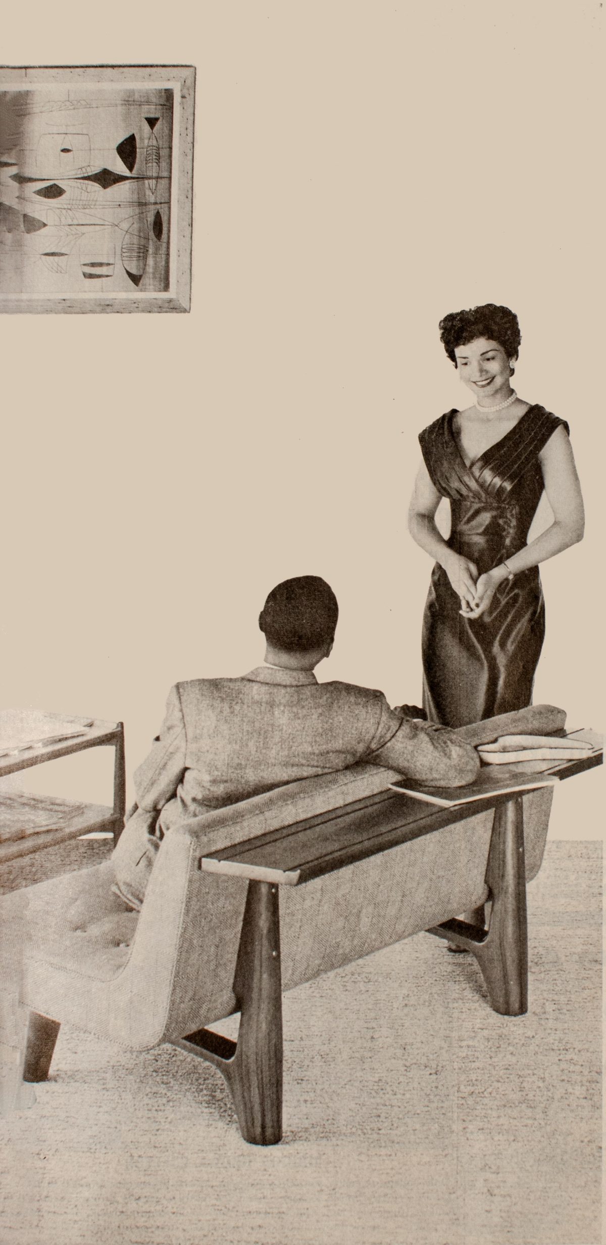
In the 1950s, like today, the media landscape was far from monolithic. The modern design that controls bodies and excludes Americans of color may have been pervasive in Life, with its predominantly white audience. But in the magazine with the largest African-American readership of the period, Ebony, modern design functions in a strikingly different way. Ebony emulated the journalistic format of Life and its commercial success, but that did not necessarily translate into a lifestyle magazine that copied Life’s whiteness. Mid-century Ebony is a complex archival source, to be sure, but there are a few things that stand out. Modern design hardly ever appears in advertisements for cleaning supplies. Rather, it most commonly appears as a prop in advertisements selling a vision of Black social confidence: a couple in their modern home in an ad for Chicago Metropolitan Mutual Assurance Company, or men relaxing with drinks (one of them in Saarinen’s Womb Chair) in a Lord Calvert Whiskey ad. A feature article on the modern designs of Add Bates (who made custom furniture for Richard Wright, among others) quoted his belief that modern design could “impart that warm, personal feeling so many people desire,” a far cry from the abstractions of Nelson’s point of view.
Women and modern design are regularly associated in mid-century Ebony — the curves of one referencing the curves of the other — but with some surprising improvisations. In more than one fashion spread, Ebony’s fashion photographer, working under the name Christa, photographed women standing in or stepping through the distinctive arced frame of a Butterfly Chair (without its canvas or leather seat). The model steps up and out of the chair frame. This modern design might put her on display, but it doesn’t control her.
In the mid-century period, for white audiences, modern design was a tool of control and exclusion, a prop to maintain white racial exclusivity. For the Black audiences of the Johnson Publishing Company’s Ebony, modern design was a source of empowerment and social agency. It is no surprise, perhaps, that modern design was therefore popular in the mid-century world. Designs take on meaning depending on where and how they are used. Mid-century modern design reinforced whiteness in white worlds, and enabled a vision of empowered lifestyles in Black worlds.
Why is “mid-century modern” so popular today? These designs have, once again, taken on new meanings in our 21st-century world. But, to the extent that they still signify exclusion or control of bodies — to the extent that the singular lounge chair, silhouetted against a window, puts the sitter’s body on display for everyone else in the room — we should all think twice about how we use modern design.
0 Commentaires